Feature #9209
Assistant: Improve overview
100%
Description
- Wireframe
- Elements
- Infography
Files
Subtasks
| Feature #10105: Assistant: Mention "smartphone" in "another screen" | Resolved | tchou | 0 |
||
| Feature #10106: Assistant: Add something about data loss in overview | Resolved | 0 |
Related issues
|
Blocked by Tails - |
Resolved | 2015-04-08 | |
|
Blocks Tails - |
Resolved | 2015-04-08 |
History
#1 Updated by sajolida 2015-04-08 21:10:26
- blocked by
Feature #9208: Assistant: Review overview with wedodata added
#2 Updated by sajolida 2015-04-08 21:10:35
- blocks
Feature #9210: Assistant: Write web prototype of overview added
#3 Updated by sajolida 2015-05-01 08:36:17
- Target version set to Tails_1.4.1
#4 Updated by sajolida 2015-05-19 19:22:38
- Affected tool set to Installation Assistant
#5 Updated by tchou 2015-05-21 14:39:05
- File overview-20150521-tchou.odg added
- File overview-20150521-tchou.pdf added
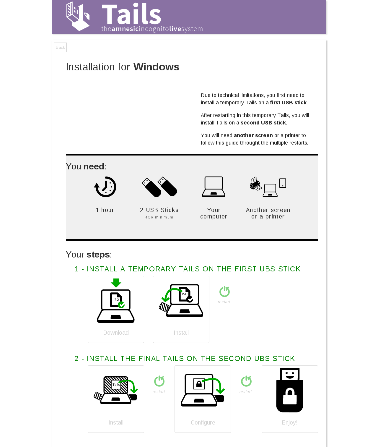
Some improvements :
- Add the need of the second screen
- Less steps so it’s easier to get the step
- I keep the reboots but not as steps
- Button to start
- Some colors to get the blocks of information
- I removed the USB in the title, but we need a way to bring it back
#6 Updated by sajolida 2015-05-22 16:23:20
At first sight it looks very good!
When you believe you are done with your work, mark the ticket as “Ready for QA” and assigned to me so I now it’s ready for a proper review.
#7 Updated by tchou 2015-05-22 18:29:05
- Assignee changed from tchou to sajolida
- QA Check set to Ready for QA
#8 Updated by sajolida 2015-05-28 16:53:27
I reviewed with a friend of mine, and here are some comments:
- Her first reaction was that it looked very nice. So was mine :)
- We don’t say “reboot” but “restart” and she indeed didn’t knew this word.
- It’s not clear whether the first step involves one or two computers as they appear in the same image. I propose we split this step into two and have “1. Download and verify” and then “2. Install temporary Tails”. That’s 5 steps instead of 4. Note that for the scenarios where there is no temporary Tails, we need this step anyway, so it will make all scenarios more consistent to have download as a first separate step.
- The USB size indication was too small.
- She didn’t understand the persistence part. I think the notion of persistence needs to be explained a bit somehow because it’s the first time we’re mentioning it in the Installation Assistant. We should also say this is optional. In the thread about terminology we also agree to use “encrypted persistent storage” as “persistence” is not an object but the quality of an object. What about saying instead “Create encrypted persistent storage” as title with a subtitle maybe saying “to store your documents and configuration”.
- As I suggested in the thread on terminology, I propose to call the second USB stick “final Tails” (and neither “Tails” only as in the top-right corner, neither “full Tails” as in the title of the 2nd step). As it’s not clear whether Tails with or without persistence should be called “full” and “final” opposes better to “temporary”.
- The explanation about why we need a second screen could be put closer to the image about the second screen (instead of at the end of the blob of text). I propose to put it under “Another screen or printer” and say “to follow instructions when restarting” (maybe a bit smaller).
- Usually in documentation instructions we use bold and italic with specific semantics (bold is for UI labels for example). Outside of the doc, it’s ok to use bold to make it easier to scan a text. But here we’re not really showing a lot of text (mostly labels and titles) and we’re right before a huge set of instructions. So maybe I’d rather avoid using bold here as we can live without it.
- Other than that, she had no problem understanding the temporary Tails, the restarts on the temporary Tails, etc. Surprisingly, she had a harder time understanding the full set of images from the SVG infography…
If you’re fine with that, I’d suggest you implement those changes and then we can ask for more reviews and testing on tails-ux.
#9 Updated by sajolida 2015-05-28 16:55:01
- Assignee changed from sajolida to tchou
- QA Check changed from Ready for QA to Dev Needed
#10 Updated by tchou 2015-06-11 09:38:39
- Assignee changed from tchou to sajolida
I was thinking to implement directly and test on bootstrap.
#11 Updated by tchou 2015-06-11 12:44:50
- File overview-20150521-tchou-2.odg added
- File overview-20150521-tchou-2.pdf added
Finaly an other .odg version, to get a better image before bootstrap implementation.
#12 Updated by tchou 2015-06-11 13:00:47
> * Her first reaction was that it looked very nice. So was mine :)
Thanks :)
> * We don’t say “reboot” but “restart” and she indeed didn’t knew this word.
done.
> * It’s not clear whether the first step involves one or two computers as they appear in the same image. I propose we split this step into two and have “1. Download and verify” and then “2. Install temporary Tails”. That’s 5 steps instead of 4. Note that for the scenarios where there is no temporary Tails, we need this step anyway, so it will make all scenarios more consistent to have download as a first separate step.
done.
> * The USB size indication was too small.
done.
> * She didn’t understand the persistence part. I think the notion of persistence needs to be explained a bit somehow because it’s the first time we’re mentioning it in the Installation Assistant. We should also say this is optional. In the thread about terminology we also agree to use “encrypted persistent storage” as “persistence” is not an object but the quality of an object. What about saying instead “Create encrypted persistent storage” as title with a subtitle maybe saying “to store your documents and configuration”.
I feel it’s a lot of explanation, and the only one, and for an optional step, so I just changed the label (which is also quite long).
> * As I suggested in the thread on terminology, I propose to call the second USB stick “final Tails” (and neither “Tails” only as in the top-right corner, neither “full Tails” as in the title of the 2nd step). As it’s not clear whether Tails with or without persistence should be called “full” and “final” opposes better to “temporary”.
I’m not shure to understand the whole thing. Say me id it’s ok.
> * The explanation about why we need a second screen could be put closer to the image about the second screen (instead of at the end of the blob of text). I propose to put it under “Another screen or printer” and say “to follow instructions when restarting” (maybe a bit smaller).
done.
> * Usually in documentation instructions we use bold and italic with specific semantics (bold is for UI labels for example). Outside of the doc, it’s ok to use bold to make it easier to scan a text. But here we’re not really showing a lot of text (mostly labels and titles) and we’re right before a huge set of instructions. So maybe I’d rather avoid using bold here as we can live without it.
I like the way I used it here: it gives focus and rythm. I don’t really understand the problem. Maybe we’ll go deepeer discussing other semantic doc relative things.
#13 Updated by tchou 2015-06-11 23:35:15
- File overview-bootstrap-other-direction.png added
I’ve lost my message with my battery, so I’ll be quick.
New proposal for the overview:
- in html and css (bootstrap)
- focusing on simplifing the flow by grouping items and removing words
No more “persistence” “verify” “optional” concepts now, because it can be explained later.
“Create encrypted persistent storage ” become “configure”.
2 bigs steps :
- 1: install temporary tails on the first usb stick
- 2: install final tails on the second usb stick
All this is on my repo (http://repo.or.cz/w/tails/tchou.git/shortlog/refs/heads/web/assistant).
Be carefull, quick and dirty css inside.
#14 Updated by tchou 2015-06-12 12:45:50
New repo, please forget the old one : https://git-tails.immerda.ch/tchou/tails/log/?h=web/assistant
#15 Updated by sajolida 2015-06-17 09:48:07
- Assignee changed from sajolida to tchou
Cool, I’m really excited to see this on a webpage (even if I reckon that I didn’t build the website nor looked at the code). I think there are still important stuff to solve regarding the structure and placement before looking at the implementation details (but it’s super cool to be working on it already).
Here are a few answers to my previous comments:
>> The USB size indication was too small.
> done.
I think you actually made it smaller in proportion with the text that it was before. You also made it gray instead of black. So I see two factors to make this overall less visible than it was. But maybe my tester was not representative and this won’t be problematic in general. And also, it’s " GB" in English, with a space and a capital “GB”.
>> The explanation about why we need a second screen could be put closer to the image about the second screen (instead of at the end of the blob of text). I propose to put it under “Another screen or printer” and say “to follow instructions when restarting” (maybe a bit smaller).
> done.
I don’t see that on your image. I understand that you might be reluctant to adding text below the picture, but I really think that this text belongs there and nowhere else. It could then be summarized as “to follow the instructions after restarting”, save us a few words, and make the intro text 30% shorter.
> I feel it’s a lot of explanation, and the only one, and for an optional step, so I just changed the label (which is also quite long).
Yes, let’s try to call this “Configure” only so we don’t have to explain yet what is the persistence.
> I like the way I used it here: it gives focus and rythm. I don’t really understand the problem. Maybe we’ll go deeper discussing other semantic doc relative things.
I’m OK to use bold on this page in a special way, even though I don’t think it brings much; and it’s definitely not semantic here :)
Other than that:
- In the Windows synopsis I’m saying “Restart on” instead of “Restart in”. Shall we do that here as well?
- “2 USB sticks”: to be consistent with the way we refer to them in the instructions this should rather be “2 flash memories” and below “USB sticks or SD cards (at least 4 GB)”.
- I don’t like having the label of the steps in gray instead of black. I think the labels are as important as the images themselves (otherwise we wouldn’t need them) and shouldn’t be put in the background like this.
- You capitalize inconsistently the labels of the steps and “restart”. I would say “Restart” instead of “restart”. And gray is hard for me to read here on my bad screen with such a small font.
- You’re not using the latest version of the infography (for example the USB stick appears with an angle). But maybe you’re planning to fix that later on, so no big deal.
- You’re now limiting yourself to two big steps with a long title and several unnumbered substeps with images. I think this won’t work well for people installing on Debian for example, as they won’t go through the temporary Tails. I would instead continue advertising 5 steps for Windows install and 4 for Debian install. We could also not advertise nor count “Enjoy!” as a step and have 4 and 3 steps respectively which is not a lot already. I think that your previous design was better on this.
- You removed the “I’m ready, let’s start” button. Maybe we could make it shorter and say “Let’s start” only.
#16 Updated by tchou 2015-06-17 14:42:38
sajolida, I’m not shure that you have noticed that you are talking about two different mockups.
- The first one is a pdf and an odg and comes with the #note-12.
- The second one a screenshot of a html/css other mockup, coming with comments after.
I’ll come back on your comments later.
#17 Updated by tchou 2015-06-17 14:43:47
- Assignee changed from tchou to sajolida
- QA Check deleted (
Dev Needed)
juste to ping you for my last comment.
#18 Updated by sajolida 2015-06-18 06:42:03
- Assignee changed from sajolida to tchou
All-right, now I see! You changed stuff in both places: the PDF and the web prototype. Could you try to merge them in a single document that I should comment on?
#19 Updated by BitingBird 2015-07-01 11:51:58
- Target version changed from Tails_1.4.1 to Tails_1.5
#20 Updated by tchou 2015-08-06 01:39:05
- Target version changed from Tails_1.5 to Tails_1.6
#21 Updated by sajolida 2015-08-15 08:16:22
- Priority changed from Normal to Elevated
This has been postponed twice, so raising priority.
#22 Updated by BitingBird 2015-08-25 13:54:22
- Category set to Installation
#23 Updated by tchou 2015-09-19 01:20:10
- File overview-bootstraped.png added
- Assignee changed from tchou to sajolida
- QA Check set to Ready for QA
Last version of the overview (I did a few week ago).
Let’s discuss this one :
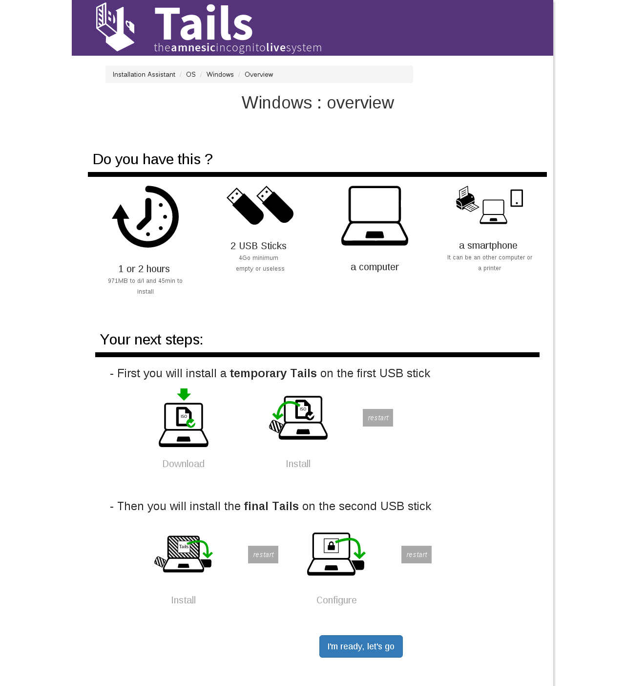
- I removed the introduction. I felt it was redundant with the “steps” and “needs” instructions.
- I removed the enjoy step
- I keept the 2 big steps, because for this scenario I felt it was important. Maybe the layout will be a bit different for other scenarios.
- The icon size are not good (and I will use the png) and are not the last ones
- I used just text for restart to focus on the other steps (but keep this information)
- I need to change the other screen icon with more smartphone (Feature #10105)
#24 Updated by sajolida 2015-09-21 10:28:39
- Target version changed from Tails_1.6 to Tails_1.7
Postponing.
#25 Updated by BitingBird 2015-09-22 15:36:15
- Status changed from Confirmed to In Progress
#26 Updated by sajolida 2015-09-23 09:02:09
- Assignee changed from sajolida to tchou
- QA Check changed from Ready for QA to Dev Needed
Cool! I like the structure of the bottom part better.
Still, I see that many of the concerns I raised in Feature #9209#note-15 were
not addressed. Can you read that note again and make sure to either
apply them or get back to me on each of them?
> - I removed the introduction. I felt it was redundant with the “steps” and “needs” instructions.
Ok. But didn’t we said we should move the explanation about the need for
a second scree closer to the corresponding logo?
> - I removed the enjoy step
Ok.
> - I keept the 2 big steps, because for this scenario I felt it was important. Maybe the layout will be a bit different for other scenarios.
Sure. No problem.
> - I used just text for restart to focus on the other steps (but keep this information)
That’s ok in principle. But your “restarts” here look like Bootstrap
buttons and this might be problematic. Also, white on read is very hard
to read.
> - I need to change the other screen icon with more smartphone (Feature #10105)
Have a look at the ones I used in the infography. Their style is closed
to the rest of the infography. If you like them better, please reuse
them in the overview. Otherwise please find better ones and I’ll updated
them in the overview. I don’t see any good reason to have two different
series of logo to refer to the same action.
#27 Updated by sajolida 2015-09-23 09:03:17
Ah, and also, I don’t like “Do you have this?” and you’re not justifying your change.
#28 Updated by tchou 2015-11-17 16:45:12
- Assignee changed from tchou to sajolida
- QA Check changed from Dev Needed to Ready for QA
- Feature Branch set to web/9209-improve-overview
Please start looking from : efbdb91ff9dce4aca7145e78691b61463cb9b6e0
At least there is only one common file for all overviews.
#29 Updated by sajolida 2015-11-18 03:26:16
- File firefox complains.png added
- Assignee changed from sajolida to tchou
- QA Check changed from Ready for QA to Dev Needed
Done. I’m pushing some minor fixes on web/9209-improve-overview so make sure to fetch them.
I find it great the way you factorized all the code, this will make future changes much easier. As a general note, I’m not convinced by your new design and I think that the one you had last Friday was better at providing an overview.
Here are a few additional comments, the first two being the most important to me:
0. The news steps don’t fit vertically on my screen. Ok, I don’t have a very big screen but I’m in Tor Browser on a laptop and I bet many other people will. I think this is quite problematic here to have to scroll to see the steps as we are pretending to present an “overview”.
1. expert/usb and debian/usb: Why does
“configure” deserves a special treatment on this scenario while it
doesn’t on win/usb and debian/clone for example? These scenario are
intrinsically shorter and simplier than win/usb so having the two big
green phases seems artifical and unnecessary here.
2. debian/clone: “Download” on restart image. Missing download image?
3. debian/clone: See 4f7acd9 and please do the same everywhere else.
4. Why do we have expert/overview.html and expert/usb/overview.html?
5. linux/clone: Missing title
6. mac/dvd: Missing 1-dvd.png
7. mac/dvd: Say “Burn” for DVD instead of “install” as we do in router.
8. Inconsistent use of “: overview” in title, some have some don’t.
9. Don’t duplicate /* Hide all scenario-dependent bits by default. */, see dd134a1 in web/8568-extension-in-assistant.
10. Missing overview for upgrade/clone and upgrade/tails (upcoming upgrade/expert).
11. po4a and Firefox complain about your HTML structure on overview.html. See screenshot in attachement.
#30 Updated by sajolida 2015-11-18 03:40:41
Pushed some more stuff again, make sure to fetch and merge once more if you did already.
#31 Updated by tchou 2015-11-18 05:26:52
- Assignee changed from tchou to sajolida
- QA Check changed from Dev Needed to Ready for QA
> Here are a few additional comments, the first two being the most important to me:
>
> 0. The news steps don’t fit vertically on my screen. Ok, I don’t have a very big screen but I’m in Tor Browser on a laptop and I bet many other people will. I think this is quite problematic here to have to scroll to see the steps as we are pretending to present an “overview”.
I’m not shure to understand. On my little screen with FF the steps are fiting (maybe missing 3px). Anyway I agree it can be more compact. See 49c3d909e2ca707f07d4368b8972d3e391bc83a1
> 1. expert/usb and debian/usb: Why does
> “configure” deserves a special treatment on this scenario while it
> doesn’t on win/usb and debian/clone for example? These scenario are
> intrinsically shorter and simplier than win/usb so having the two big
> green phases seems artifical and unnecessary here
2 reasons:
- I had only 4 steps available in one row :)
- The overview is decidated to make the upcomming steps clearer and restarts are part of the complexity, so it make sense to me beacause after installing its Tails a Debian user will have to restart it to configure it.
I let it as it is waiting to discuss it deeper.
> 2. debian/clone: “Download” on restart image. Missing download image?
It is supposed to be this restart image with the “restart” label. done in 736c466cc7164f0451fdc7df6d8327f14f8f49af
> 3. debian/clone: See 4f7acd9 and please do the same everywhere else.
done in d0c8facf72237628ffb62e90aa204c123d98531a
> 4. Why do we have expert/overview.html and expert/usb/overview.html?
removed expert/overview.html in 14b18c950deab8b7313d829a562201a64cf1f4ca
> 5. linux/clone: Missing title
done in e6f6798e174d92593f6c25a01c0bcfeda72644da
> 6. mac/dvd: Missing 1-dvd.png
done in cc70bb4eb07cc1663095e48f027d095332829acb
> 7. mac/dvd: Say “Burn” for DVD instead of “install” as we do in router.
done in 736c466cc7164f0451fdc7df6d8327f14f8f49af
> 8. Inconsistent use of “: overview” in title, some have some don’t.
At leat, I was note shure about the “:overview” in title. So I removed all in 2b3581337b3425921964288dfd9717e6f322b8df
> 9. Don’t duplicate /* Hide all scenario-dependent bits by default. */, see dd134a1 in web/8568-extension-in-assistant.
I was wondering where to move this information to avoid duplicating too.
I don’t success finding web/8568-extension-in-assistant branch.
> 10. Missing overview for upgrade/clone and upgrade/tails (upcoming upgrade/expert).
I’ll do them once the router parts will be done.
> 11. po4a and Firefox complain about your HTML structure on overview.html. See screenshot in attachement.
done in 350022fd40ea89477e964ae08129dd5de378f11b
#32 Updated by sajolida 2015-11-18 06:06:51
- Target version changed from Tails_1.7 to Tails_1.8
#33 Updated by sajolida 2015-11-19 02:43:51
- Assignee changed from sajolida to tchou
- Type of work changed from Graphics to Code
Did a bunch more stuff in 7b46cc3..a61bb72. Please review again so I can merge.
#34 Updated by tchou 2015-11-19 08:45:18
- Assignee changed from tchou to sajolida
- QA Check changed from Ready for QA to Pass
#35 Updated by sajolida 2015-11-19 08:46:49
- Status changed from In Progress to Resolved
- Assignee deleted (
sajolida) - QA Check deleted (
Pass)
Merged.
#36 Updated by sajolida 2016-05-03 09:18:21
- File overview-20150324.pdf added
An early iteraction for archiving.