Feature #16830
Rework the way "one-time" and "monthly" are coded on our donation page
0%
Description
Right-now “monthly” is the default because it’s more valuable to us but it might be surprising to the user and badly interpreted, especially if overlooked.
Could we have a mechanism that forces them to make a decision, without previous default? This would require some JavaScript.
Files
Subtasks
History
#1 Updated by sajolida 2019-06-26 15:52:00
- Assignee set to sajolida
- Target version set to Tails_3.15
#2 Updated by sajolida 2019-06-27 16:00:49
- Status changed from Confirmed to Needs Validation
- Assignee deleted (
sajolida) - Feature Branch set to web/16830-better-monthly-radio
Here is a branch. Please have a look.
It’s based on Feature #16170 so we’ll have to merge web/16170-other-ways-above-fold first.
It moves “Other ways to donate” up by only 9 pixels which is not a lot compared to what we gained in Feature #16170.
In the no-JS version, I detected that we’re giving a “Custom amount” option for one-time donations but not for recurring donations. Testing all this is a pain once you get to PayPal so I decided to give up on this. Maybe there’s a reason for that. Feel free to investigate it deeper if you think it’s worth it.
#3 Updated by Anonymous 2019-07-04 13:13:59
Hm, I don’t share your assessment that this might be surprising to the user because we clearly highlight the preselected options visually.
Now, not having a preselected option makes it harder for people to donate, because they will have to click to make a selection, which seems to be contrary to the “don’t make me think” UX principle IMO.
Also, compared to web/16170-other-ways-above-fold it looks like you make these currently visible green buttons hardly visible, by visually degrading them to a radio button.
Hence right now I would not want to merge this as is. What do you think? Or did my website build script somehow get it wrong?
#4 Updated by Anonymous 2019-07-08 14:23:49
- Assignee set to sajolida
#5 Updated by CyrilBrulebois 2019-07-10 10:34:10
- Target version changed from Tails_3.15 to Tails_3.16
#6 Updated by sajolida 2019-07-10 16:38:40
- Status changed from Needs Validation to In Progress
- Target version changed from Tails_3.16 to Tails_3.17
So your intuition and mine differ and we don’t have actual user data to prove anything. So I’ll put this on wait until I do some usability testing on this page.
- Regarding the “don’t make me think” argument, right now if they don’t “think”, the “monthly” option will be preselected for them which might not be what most people expect. I would personally feel tricked if I end up configuring a monthly donation because I didn’t pay attention or didn’t understand the state of the button that is preselected. It also requires a PayPal account. So I’m tempted to say that with the current state of things, people actually have to think a tiny bit more.
- Regarding the new buttons being “hardly visible”, I’m using the default style for radio buttons which I also thought would be more straightforward at making it clear that people have to choose one of the options, than our current custom buttons. For example, they might very well have accessibility issues since they use color alone to convey information.
But let’s not argue more based on assumptions: if my fears are founded, they will show up in the usability tests.
#7 Updated by sajolida 2019-07-10 16:39:32
- blocked by Feature #16189: Do usability testing on our donation page added
#8 Updated by intrigeri 2019-09-12 14:25:23
- Target version changed from Tails_3.17 to Tails_4.0
#9 Updated by sajolida 2019-10-07 16:22:23
- Target version deleted (
Tails_4.0) - Parent task changed from
Feature #16096to Bug #17078
We’re short on budget this year. Maybe next year.
We could do some basic A/B testing to see which version works best.
#10 Updated by sajolida 2019-11-27 10:43:13
- File constrain.webm added
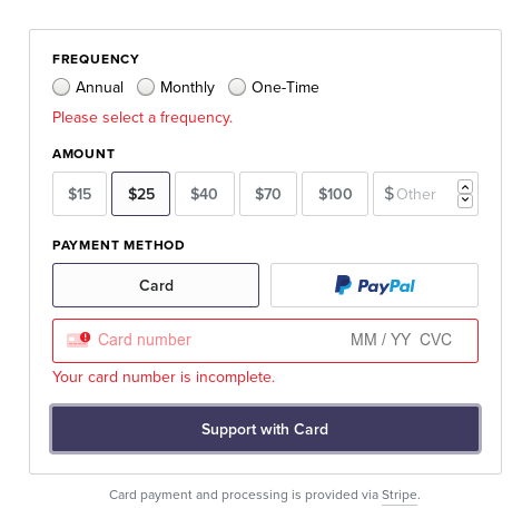
I abandoned the idea of doing usability tests of our donation process in October by lack of time and motivation. So here are a some more arguments and a proposal for data gathering if we feel the need for it.
The new proposal forces people to make a decision by adding a constrain. See screencast in attachment:
- People won’t be able to submit the form until they make a choice.
- If they try to submit the form without a choice, the checkbox gets highlighted in red and using an animation.
I think that this preferable to preselecting a monthly donation as we’re doing right now. Monthly donations are what we want but most donors give us a one-time donation.
I’ll put the debates about styling and visibility aside for now because we won’t agree without more data and I’ll stick to explaining better the benefits of the constrain:
- With the current version, if you don’t see or understand the buttons, you will submit a monthly donation which is not what most people want.
- With the proposed version, if you don’t see or understand the buttons, you will be forced to make a decision, it will be made visible to you by a red line plus an animation and the explanation about why monthly donations matter to us will be right below it.
Another alternative, would be to preselect “One-time” instead of “Monthly” in the current version.
The cheapest way of gathering data on the impact of the proposed version, would be to activate it for some times on the website and see the impact on the number of recurring donations and, most of all, whether people stick to it more or are more prone to cancel it: whether people who program a monthly donation end up giving more times or less times (aka. “retention”).
We could do the same if we decide to preselect “One-time” in the current version.
I propose to try the proposed version until the end of the donation campaign and then revert to the current version until we analyze this data in 6 months or so. If the proposed version is worse in terms of retention, next year will can try to preselect “One-time” at the beginning of the donation campaign.
moire intrigeri: I’d like you to have a look at the discussion here and the screencast before the meeting tomorrow so we can decide something in time. Otherwise, no big deal and I’ll keep it on the radar for next year.
#11 Updated by sajolida 2019-11-27 17:04:37
2 more things:
Recurring donations require a PayPal account while one-time donations don’t (in principle). Someone who starts programming a monthly donation might roll back because of this requirement and think that it also applies to one-time donations and possibly give up entirely. The proposed version moves the note about this requirement closer to the button where it matters.
To get data, it wouldn’t actually be much more work to do some slightly better A/B testing and display a different version (A. Monthly by default, B. One-time by default, and C. Nothing by default) each day (version A on day 1, version B on day 2, version C on day 3, etc.). We’ll need a bit of JavaScript for that but it would provide slightly more reliable data and we would have more flexibility on the duration of the experiment. We can use the invisible “item_name” field of the PayPal form to differentiate the different versions. The analysis itself wouldn’t be more complicated.
#12 Updated by sajolida 2019-11-28 10:52:11
- Status changed from In Progress to Needs Validation
- Assignee deleted (
sajolida) - Parent task deleted (
Bug #17078)
#13 Updated by sajolida 2019-11-28 10:52:41
- Status changed from Needs Validation to In Progress
- Type of work changed from Website to Discuss
#14 Updated by sajolida 2019-11-28 12:22:01
The mid-term evaluation is not as bad as I thought at first sight, so given our budget problem it might not be super urgent to work on this.
We could resume this work any time, especially if we do the A/B testing described in Feature #16830#note-11.
#15 Updated by moire 2019-12-10 07:49:17
Current donation page is fine.
Potential improvement: because the line with [One-time | Monthly | Yearly] has three items that look like columns, one can mistakenly understand the variation in green depth with the common pattern used to differentiate columns in a table. And not understand it is the selected item. Adding a frame around the selected plan would remove the ambiguity.
The “constrain” prototype looks good, and I think the red line animation would make the choice easy.
The nudge for a monthly or yearly donation could be improved by highlighting the corresponding sentence, maybe at the same time the red line appears?
I’m in favor of doing the A/B testing from #note11
#16 Updated by sajolida 2019-12-10 18:58:44
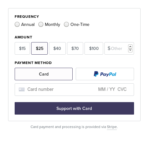
- File after.png added
- File before.png added
> Current donation page is fine.
>
> […]
>
> I’m in favor of doing the A/B testing from #note11
Ok, so let’s keep it for once we’re out of our budget crisis.
Recently I donated to BoardGameGeek (info leak!) and they have a very similar system: no selection by default and a constrain:
#17 Updated by sajolida 2020-05-07 16:18:04
- Parent task set to Feature #16189
#18 Updated by sajolida 2020-05-07 16:18:38
- Parent task changed from Feature #16189 to Feature #17697