Feature #10623
CSS Improvements on Tails Installation Assistant
0%
Description
- Improve visibility of parenthesis in router [3]
- Improve visibility of DVD and VM [4]
- Emphasis on “temporary Tails” and “final Tails” [11]
- Try to compact more the overview
- Expert: Fix left margin on titles
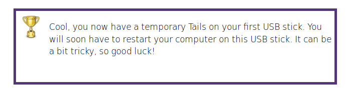
- Merge state-image with trophy [90]
Files
Subtasks
History
#1 Updated by sajolida 2015-11-24 02:46:07
- Parent task set to
Feature #8590
#2 Updated by sajolida 2015-12-01 09:07:37
While working on the DVD page, I realized that h1 + p, h1 + div + p { font-size: 18px; } in steps.css might not be flexible enough. Not all first paragraphs of steps are introduction sentences. We could have instead a
@ where relevant.
#3 Updated by sajolida 2015-12-05 09:20:16
- File trophy with margin.png added
- File trophy without margin.png added
Also, there are inconsistent margins on trophy section, see attachments.
#4 Updated by sajolida 2015-12-05 11:39:45
- File table after.png added
- File table before.png added
The format of tables suffered also from bootstrap, see attachments. I think this needs to be fixed.
#5 Updated by tchou 2015-12-14 05:25:23
- Assignee changed from tchou to sajolida
- QA Check set to Ready for QA
- Feature Branch set to web/10623-css-improvements
> Improve visibility of parenthesis in router [3]
done in 6eccd41388787b567246d92f96e3676d5700afcf
> Improve visibility of DVD and VM [4]
done in 8237d11c18aac496769e7d1523222ce377dcf93f
> Emphasis on “temporary Tails” and “final Tails” [11]
done in 9ec82408cb8e0a72d3448b366d21fd5dda7eac17
> Try to compact more the overview
done in c84f970075814c641934e246b4166499219e1071
> Expert: Fix left margin on titles
done in 15da07376ced9388dd093ddcf2a6cc567ce0ffde and partly in
15da07376ced9388dd093ddcf2a6cc567ce0ffde
> Merge state-image with trophy [90]
done in aaef249ec091f2947a008d6ffc3c535dab7c9955
#6 Updated by tchou 2015-12-14 05:26:33
If you don’t mind, once this issues are OK, I’ll do the other onces in a second wave.
#7 Updated by tchou 2015-12-14 13:59:32
done Bug #10746 in this branch.
#8 Updated by tchou 2015-12-15 07:10:29
done a href fix from Feature #9385.
#9 Updated by sajolida 2015-12-17 06:29:59
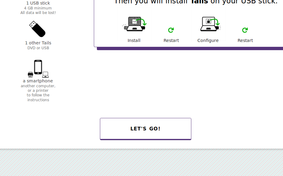
- File big empty space before let_s go.png added
- File other device is five lines.png added
- Assignee changed from sajolida to tchou
- Target version changed from Tails_1.8 to Tails_2.0
- QA Check changed from Ready for QA to Dev Needed
I merged origin/master into your branch, resolved a conflict, and pushed. So make sure fetch my work.
> - Improve visibility of parenthesis in router [3]
Good. I wonder why we don’t have a line break there, see ff4873b if you like the idea.
> - Try to compact more the overview
- You have
width: 13ca0%;in overview.css. This is not interpreted by Firefox I think. - I’m not convinced by #overview h2. I think people will miss in the corner where you put it. But I’m not convinced it’s needed either, so I might suggest to remove it all the way. But I don’t mind leave it like this as I don’t think it’s an important piece of information. If you do, then maybe you should improve its visibility.
- The needs don’t fit in my screen in vertical (Tails 800px height) for the cloning scenarios. I guess this will be a pretty common setup for people going manual upgrades from Tails but maybe you think it’s a big deal not to fit vertically. Also, as a consequence, the “Let’s go!” button has a big margin from the steps. See attachment. I’m not sure that’s expected.
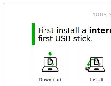
- Big titles of steps wrap in win/usb overview. I think we could live with smaller titles (for example 1.2em works). Another option would be to use infinitive instead of future sense, and say “First, install a temporary Tails on the first USB stick” but this might sound to much as an order to be performed right now.
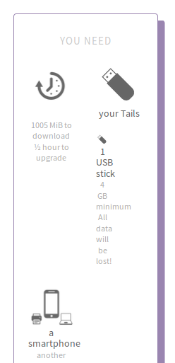
- Maybe we can make the blocks for “you need” a bit wider to prevent the one about the other device to wrap in 5 lines. See attachment.
- Why not make the “Let’s go!” button as wide as steps?
Note to make it easier to parse this ticket later on: until now you’re not addressing Feature #10623#note-2, Feature #10623#note-3, and Feature #10623#note-4.
#10 Updated by sajolida 2015-12-17 09:18:04
Sorry, moving the comment I put here to Feature #9385#note-32.
#11 Updated by sajolida 2016-01-03 19:53:08
- File green back.png added
The Back button turns green on hover. See attachment.
#12 Updated by sajolida 2016-01-05 17:43:05
- Parent task changed from
Feature #8590toFeature #8592
#13 Updated by sajolida 2016-01-12 15:34:02
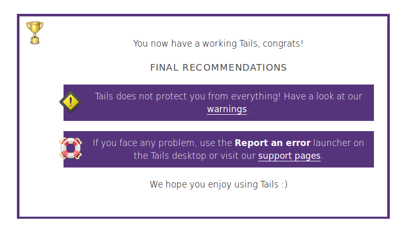
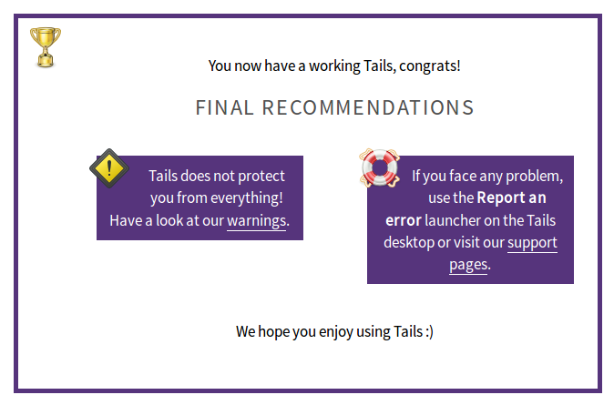
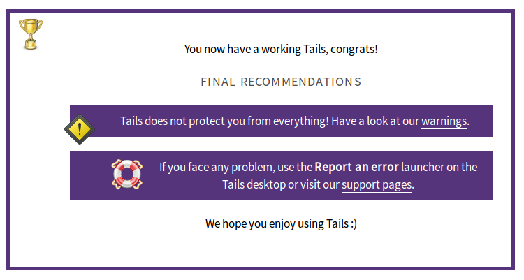
- File expert recommendations.png added
There’s an inconsistent styling on final recommendations in /install/expert/usb. See attachment.
#14 Updated by tchou 2016-01-19 00:09:19
sajolida wrote:
> The Back button turns green on hover. See attachment.
It is fixed in 62db2445fa53f26653a93c8f9345d1bceb7e12df in the web/10734-title-consistency branch.
#15 Updated by tchou 2016-01-19 12:14:17
- Assignee changed from tchou to sajolida
- QA Check changed from Dev Needed to Info Needed
I’m working on this one. Do you still have the screenshots ?
#16 Updated by sajolida 2016-01-20 18:08:07
- File debian.png added
- File expert.png added
- Assignee changed from sajolida to tchou
- QA Check changed from Info Needed to Dev Needed
See https://tails.boum.org/install/debian/usb/ and https://tails.boum.org/install/expert/usb/.
#17 Updated by tchou 2016-01-26 00:31:01
- Assignee changed from tchou to sajolida
- QA Check changed from Dev Needed to Ready for QA
It’s not perfect and there is remaining issues, but I think it’s mergeable for a first batch.
> While working on the DVD page, I realized that h1 + p, h1 + div + p { font-size: 18px; } in steps.css might not be flexible enough. Not all first paragraphs of steps are introduction sentences. We could have instead a
@ where relevant.
I’m ok with that. There is now a “.intro” class.
> Also, there are inconsistent margins on trophy section, see attachments.
TODO
> The format of tables suffered also from bootstrap, see attachments. I think this needs to be fixed.
TODO
> Good. I wonder why we don’t have a line break there, see ff4873b if you like the idea.
TODO
> > - Try to compact more the overview
>
> * You have width: 13ca0%; in overview.css. This is not interpreted by Firefox I think.
ok.
> * I’m not convinced by #overview h2. I think people will miss in the corner where you put it. But I’m not convinced it’s needed either, so I might suggest to remove it all the way. But I don’t mind leave it like this as I don’t think it’s an important piece of information. If you do, then maybe you should improve its visibility.
I removed it.
> * The needs don’t fit in my screen in vertical (Tails 800px height) for the cloning scenarios. I guess this will be a pretty common setup for people going manual upgrades from Tails but maybe you think it’s a big deal not to fit vertically. Also, as a consequence, the “Let’s go!” button has a big margin from the steps. See attachment. I’m not sure that’s expected.
Now there is 2 columns for needs.
> * Big titles of steps wrap in win/usb overview. I think we could live with smaller titles (for example 1.2em works). Another option would be to use infinitive instead of future sense, and say “First, install a temporary Tails on the first USB stick” but this might sound to much as an order to be performed right now.
- I think that the important thing is the page is this imformation, so I’m not in favor off minimaze it with 1.2em.
- While some people think that it’s already the steps, I might be not a good idea to use some kind of imperative, but I applied it.
> * Maybe we can make the blocks for “you need” a bit wider to prevent the one about the other device to wrap in 5 lines. See attachment.
> * Why not make the “Let’s go!” button as wide as steps?
It’s wider now.
>
> Note to make it easier to parse this ticket later on: until now you’re not addressing Feature #10623#note-2, Feature #10623#note-3, and Feature #10623#note-4.
#18 Updated by sajolida 2016-01-26 18:23:39
- File 4 needs.png added
- File also.png added
- File back.png added
- File left margin.png added
- File need.png added
- File recommendations.png added
- File step number.png added
- File toggle.png added
- File trophy.png added
- Assignee changed from sajolida to tchou
- Target version changed from Tails_2.0 to Tails_2.2
- QA Check changed from Ready for QA to Dev Needed
- Feature Branch changed from web/10623-css-improvements to web/10623-css-improvements
I don’t think I can merge this on the last minute. Here is a first batch of broken things. Also make sure to merge origin/master into your branch as it has some tricky conflits. I tried to solve them here to build the page but maybe I fucked some things up while doing so.
- Introducing .intro class but it’s not used.
- Retroducing inconsistent “temporary” terminology
- Glitch on “Back” button. See back.png.
- What about reducing left margin on headings to hopefully prevent wrapping? See left margin.png.
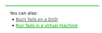
- Double-underline on .also. See also.png.
- Broken margin on toggle. See toggle.png.
- Missing margin in trophy. See trophy.png.
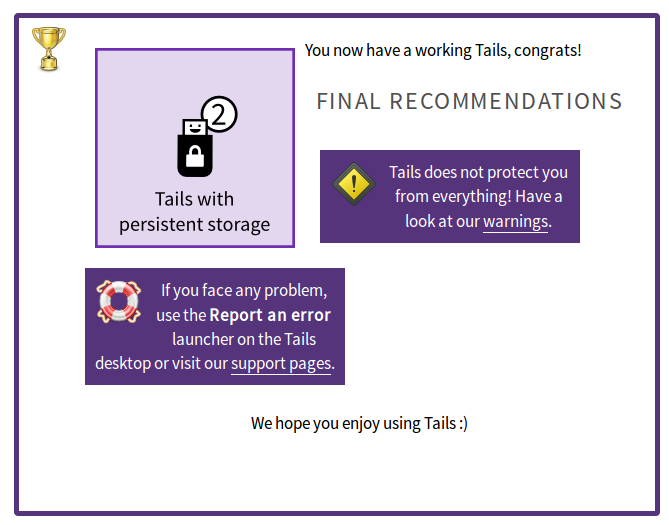
- Broken layout on recommendations. See recommendations.png.
- Hidden step number with small browser width. See step number.png
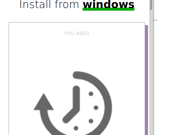
- Super big “need” with small browser width. See need.png.
- Broken layout with 4 needs. See 4 needs.png.
#19 Updated by sajolida 2016-01-29 18:14:35
- Parent task deleted (
Feature #8592
#20 Updated by sajolida 2016-04-01 10:35:41
- blocks #8538 added
#21 Updated by sajolida 2016-04-01 11:01:22
- Target version deleted (
Tails_2.2)
#22 Updated by tchou 2016-08-17 08:28:34
- Assignee changed from tchou to sajolida
- QA Check changed from Dev Needed to Ready for QA
> Introducing .intro class but it’s not used.
Yes. Next step is to add it to the relevents paragraphs (https://labs.riseup.net/code/issues/10623#note-2)
> Retroducing inconsistent “temporary” terminology
I don’t find it, maybe I fixed it without notifing it. Where is it ?
> Glitch on “Back” button. See back.png.
> The Back button turns green on hover. See attachment.
Fixed with 1ecc5f0cf8620c3dbd3b73a6a68fd5a0c4a61847
> What about reducing left margin on headings to hopefully prevent wrapping? See left margin.png.
> Double-underline on .also. See also.png.
Fixed with 1ecc5f0cf8620c3dbd3b73a6a68fd5a0c4a61847
> Broken margin on toggle. See toggle.png.
Fixed with 6ebd4fbeaaeb00bef56f2d8ad3ac2f8576b4dc0c
> Missing margin in trophy. See trophy.png.
Fixed with 630e31fff03b4793514e84f5b297bf420ded269c
> Broken layout on recommendations. See recommendations.png.
Fixed with 3b35ce799048616aa06be8c24a15259e5877b59e
> Hidden step number with small browser width. See step number.png
Fixed with 28375c58a1cea164aa439781cc91da81d94f9ef1
> Super big “need” with small browser width. See need.png.
Fixed with c5e428fe61d5eeb48aed8d450ca7f658243396af
> Broken layout with 4 needs. See 4 needs.png.
Can reproduce it, working in local (maybe I fixed it with an other commi)
> Also, there are inconsistent margins on trophy section, see attachments.
I can’t see this attachment. In local seems ok.
> The format of tables suffered also from bootstrap, see attachments. I think this needs to be fixed.
I can’t see this attachment. Added some padding in c43a60b51e72735e0c02704be7ea858f11b0b0f5
> Good. I wonder why we don’t have a line break there, see ff4873b if you like the idea.
I’m not shure to get this point. In local seems ok, and I can’t find where is defined the “two-lines” css.
> There’s an inconsistent styling on final recommendations in /install/expert/usb. See attachment.
Fixed with 27d7724b0d80d2ef014a1ab4eca3e0b7f726c79a
> merge master
I tried to merge but I think that some .po files came with (I tried to removed them, but I think it failed).
#23 Updated by tchou 2016-08-18 02:06:56
I did some new changes on the css and tested in this branch https://labs.riseup.net/code/issues/10793
#24 Updated by sajolida 2016-08-25 07:37:10
>> Introducing .intro class but it’s not used.
> Yes. Next step is to add it to the relevents paragraphs (https://labs.riseup.net/code/issues/10623#note-2)
Ok, but this is CSS (in the sense of “graphical styling”) and I
personally don’t think that’s what you are proposing is needed from a
technical writing point of view. So if you still feel strong about that,
please implement the
yourself.
>> Retroducing inconsistent “temporary” terminology
> I don’t find it, maybe I fixed it without notifing it. Where is it ?
Fixed in bb0c2af.
>> Glitch on “Back” button. See back.png.
>> The Back button turns green on hover. See attachment.
> Fixed with 1ecc5f0cf8620c3dbd3b73a6a68fd5a0c4a61847
Ok!
>> What about reducing left margin on headings to hopefully prevent wrapping? See left margin.png.
>
>> Double-underline on .also. See also.png.
> Fixed with 1ecc5f0cf8620c3dbd3b73a6a68fd5a0c4a61847
Ok!
>> Broken margin on toggle. See toggle.png.
> Fixed with 6ebd4fbeaaeb00bef56f2d8ad3ac2f8576b4dc0c
I added a bit more space in d4691d9 to prevent covering the ‘x’ link.
>> Missing margin in trophy. See trophy.png.
> Fixed with 630e31fff03b4793514e84f5b297bf420ded269c
Ok!
>> Broken layout on recommendations. See recommendations.png.
> Fixed with 3b35ce799048616aa06be8c24a15259e5877b59e
Ok, I improved a bit on that in 185a17c.
>> Hidden step number with small browser width. See step number.png
> Fixed with 28375c58a1cea164aa439781cc91da81d94f9ef1
Ok.
>> Super big “need” with small browser width. See need.png.
> Fixed with c5e428fe61d5eeb48aed8d450ca7f658243396af
The overview with small browser width is still very broken. I fixed that
through several commits.
>> Broken layout with 4 needs. See 4 needs.png.
> Can reproduce it, working in local (maybe I fixed it with an other commi)
Ok.
>> The format of tables suffered also from bootstrap, see attachments. I think this needs to be fixed.
> I can’t see this attachment. Added some padding in c43a60b51e72735e0c02704be7ea858f11b0b0f5
Further improved with c40d772.
>> Good. I wonder why we don’t have a line break there, see ff4873b if you like the idea.
> I’m not shure to get this point. In local seems ok, and I can’t find where is defined the “two-lines” css.
Fixed in 48f8545, sorry.
>> There’s an inconsistent styling on final recommendations in /install/expert/usb. See attachment.
> Fixed with 27d7724b0d80d2ef014a1ab4eca3e0b7f726c79a
Ok.
>> merge master
> I tried to merge but I think that some .po files came with (I tried to removed them, but I think it failed).
You deleted many translations and I had to rescue them in 5727745 :(
So, 5 hours of work later I’m done reviewing and fixing your branch.
I also cleaned up some code and rolled back your latest structural
change to the overview which I think is risky.
Please have a second look, maybe adjust again some typography on the
overview if you want (but please not the structure again!) and then we
can merge. Yeah!
#25 Updated by sajolida 2016-08-25 07:37:59
- Status changed from Confirmed to In Progress
- Assignee changed from sajolida to tchou
#26 Updated by tchou 2016-09-12 02:48:18
- Assignee changed from tchou to sajolida
- QA Check changed from Ready for QA to Info Needed
I’m fine with the current state of the repo, except 2 things:
- Why are the state-images out of the trophy ? I did it for “Merge state-image with trophy” issue and I think you removed it fixing bb0c2af2e32496103d92862bcab4a9c663e6b3f0
- For the minor links in color (450138c4f83319534b130894e40aa2a636d8c99f) we could keep an “hover” state.
(and it’s not css related but I just discoverd something that look like a bug: on mac/dvd, there is a “install the final Tails” extra step. I can create a ticket if you want.)
#27 Updated by sajolida 2016-09-12 14:37:35
- Assignee changed from sajolida to tchou
- QA Check changed from Info Needed to Ready for QA
> - Why are the state-images out of the trophy ? I did it for “Merge state-image with trophy” issue and I think you removed it fixing bb0c2af2e32496103d92862bcab4a9c663e6b3f0
Oops, indeed. I thought your change was a bug because:
- It was hidden in the middle of a conflict resolution in 1267d7c.
- It was not applied consistently on the state-image of all the other steps.
But I forgot about the original intention in “Merge state-image with trophy [90]”. So now I tried to do this in 95762d3. Please have a look.
> - For the minor links in color (450138c4f83319534b130894e40aa2a636d8c99f) we could keep an “hover” state.
I don’t see which problem this would solve, especially given that now we have green and underline links just as everywhere else in the website (including in the assistant). So I think they are interpreted correctly as links (otherwise we have a bigger problem).
> (and it’s not css related but I just discoverd something that look like a bug: on mac/dvd, there is a “install the final Tails” extra step. I can create a ticket if you want.)
Good catch! Fixed in e6b4b82.
So can you do a final review of c2e8c58..2601f5d maybe and then I can merge?
#28 Updated by tchou 2016-09-13 01:36:40
sajolida wrote:
> > - Why are the state-images out of the trophy ? I did it for “Merge state-image with trophy” issue and I think you removed it fixing bb0c2af2e32496103d92862bcab4a9c663e6b3f0
>
> Oops, indeed. I thought your change was a bug because:
>
> * It was hidden in the middle of a conflict resolution in 1267d7c.
It was done previously in aaef249ec091f2947a008d6ffc3c535dab7c9955, and again because of conflicts.
> * It was not applied consistently on the state-image of all the other steps.
Ha.
>
> But I forgot about the original intention in “Merge state-image with trophy [90]”. So now I tried to do this in 95762d3. Please have a look.
>
> > - For the minor links in color (450138c4f83319534b130894e40aa2a636d8c99f) we could keep an “hover” state.
>
> I don’t see which problem this would solve, especially given that now we have green and underline links just as everywhere else in the website (including in the assistant). So I think they are interpreted correctly as links (otherwise we have a bigger problem).
Because visual hover states afford “clickablity”, and it’s not because someting is sufficient thant we can not make it better. But keep it like that if you want.
> > (and it’s not css related but I just discoverd something that look like a bug: on mac/dvd, there is a “install the final Tails” extra step. I can create a ticket if you want.)
>
> Good catch! Fixed in e6b4b82.
>
> So can you do a final review of c2e8c58..2601f5d maybe and then I can merge?
I think that e69f7ed5599cdecbcc67afcd65f1d5763269f023 has 2 side effects:
- back button has a strange side underline
- in recommandations, links are underlines in white (underline) and green (border)
#29 Updated by tchou 2016-09-13 01:37:01
- Assignee changed from tchou to sajolida
- QA Check changed from Ready for QA to Dev Needed
#30 Updated by sajolida 2016-09-25 11:19:30
> I think that e69f7ed5599cdecbcc67afcd65f1d5763269f023 has 2 side effects:
> - back button has a strange side underline
> - in recommandations, links are underlines in white (underline) and green (border)
I fixed this in 9ac380b and c215456… and finally merged this branch!
Congrats!
#31 Updated by sajolida 2016-09-25 11:22:29
- Status changed from In Progress to Resolved
- Assignee deleted (
sajolida) - QA Check deleted (
Dev Needed)
#32 Updated by sajolida 2016-09-25 11:22:41
- Category set to Installation