Feature #9206
Assistant: Write web prototype for steps
100%
Description
Files
Subtasks
History
#1 Updated by sajolida 2015-04-08 21:03:09
- blocked by
Feature #9203: Write content for all scenarios added
#2 Updated by sajolida 2015-05-01 09:15:38
- Parent task deleted (
Feature #9199
#3 Updated by sajolida 2015-05-01 09:16:04
- Parent task set to
Feature #9310
#4 Updated by sajolida 2015-05-01 09:20:11
- Parent task deleted (
Feature #9310
#5 Updated by sajolida 2015-05-01 09:23:16
- Parent task set to
Feature #9310
#6 Updated by sajolida 2015-05-19 19:24:33
- Affected tool set to Installation Assistant
#7 Updated by sajolida 2015-07-24 14:06:42
- Type of work changed from Website to Discuss
From the tests of the Windows scenario, it might be better to have everything on a single page. Then we should find a way of still making it clear to people in which step they are.
#8 Updated by BitingBird 2015-08-25 14:20:06
- Category set to Installation
#9 Updated by sajolida 2015-09-09 04:49:43
- Assignee changed from sajolida to tchou
- Target version set to Tails_1.6
- QA Check set to Ready for QA
- Feature Branch set to web/9206-steps-prototype
Done in web/9206-steps-prototype. As I can’t integrate your work on Bootstrap in web/assistant, I drafted a simple CSS overlay for this specifically. But it was simple enough. Tell me what you think.
I branched this from web/10103-windows as the many changes I did for this branch would otherwise create tons of painful conflicts when merging. I though it was ok to believe that most of the changes made on web/10103-windows would be validated soon.
#10 Updated by tchou 2015-09-18 07:53:59
I failed building ikiwiki on this branch.
#11 Updated by sajolida 2015-09-18 10:10:10
I think I identify what’s your problem (see email in private). You should now be able to build this.
#12 Updated by tchou 2015-09-19 02:22:20
- File sajolida-steps.png added
The steps by sajolida, if people want to have a look easily :
My comments:
- I imagined something more complicated, but it’s ok this way.
- I like the side illustrations, and the in-flow states illustrations.
- We need more space between steps and maybe background no make sequencing clearer
- Maybe some more modern and consistant icons (monochrome, noun project style ?) for bugs, info… (we will have backgrounds and borders to add visual semantics)
- Maybe smaller and right positionned screenshots to focus on instructions ? (it can be done in css)
- Bigger titles ?
#13 Updated by tchou 2015-09-19 02:24:38
- Assignee changed from tchou to sajolida
- QA Check changed from Ready for QA to Info Needed
I think I will follow the html and css dev on this (after git issues are done) ?
#14 Updated by sajolida 2015-09-21 10:28:28
- Priority changed from Normal to Elevated
- Target version changed from Tails_1.6 to Tails_1.7
Postponing and so raising priority.
#15 Updated by sajolida 2015-09-23 04:53:23
> - I like the side illustrations, and the in-flow states icons.
Thanks!
> - We need more space between steps and maybe background no make sequencing clearer
- What do you mean by “more space between steps”? More vertical spaces
between numbered steps or between h1 headers? - I think there’s a grammar mistake in “maybe background no make
sequencing clearer” that prevent me from understanding what you are
referring to. Which “background”?
> - Maybe some more modern and consistant icons (monochrome, noun project style ?) for bugs, info… (we will have backgrounds and borders to add visual semantics)
These are the ones we are using in all the rest of the website. They
come from the GNOME icons and I’ve never been reported any serious
problem with them. Feel free to open another ticket to change these
icons everywhere else on the website (unless you are proposing to have
different icons in the Installation Assistant and in the rest of the
website). But don’t expect me to work hard on this.
> - Maybe smaller and right positionned screenshots to focus on instructions ? (it can be done in css)
I tried smaller screenshot but the problem is that then the small fonts
on the screen get blurry. I’ll make a small branch so you can see how it
looks with smaller screenshots. I’ll align them on the right as well to
see how it looks.
> - Bigger titles ?
Same here. These are the titles that we have been using everywhere else
on the website. Unless you want to have a different typography on the
Installation Assistant, if you think there is a serious problem with
these titles (h1 currently) this should be solved everywhere on the
website and not only here. We have other long pages of instructions
elsewhere so if that’s problematic they’ll suffer from the same issue.
Note that I don’t personally think that this is problematic to the point
of being solve for the release of the Installation Assistant.
#16 Updated by sajolida 2015-09-23 04:53:39
- QA Check changed from Info Needed to Dev Needed
#17 Updated by sajolida 2015-09-24 08:29:55
- Assignee changed from sajolida to tchou
- QA Check changed from Dev Needed to Ready for QA
Actually, as this was only one commit I added it to the same branch. That’s commit 5f6c0a6. All screenshots are shrunk to 67% and aligned on the right.
So please review and if you like it I’ll merge this branch into master.
By the way, how do you do you big and long screenshots of web pages? I tried to do that but I didn’t find out an easy of doing them.
#18 Updated by tchou 2015-09-24 23:01:25
sajolida wrote:
> By the way, how do you do you big and long screenshots of web pages? I tried to do that but I didn’t find out an easy of doing them.
I use “Full Page Screen Capture” addon on Chromium. The guess there is the same kind of addon in FF.
I come back later for the feedback.
#19 Updated by tchou 2015-09-25 00:43:57
- Assignee changed from tchou to sajolida
- QA Check deleted (
Ready for QA)
sajolida wrote:
> > - I like the side illustrations, and the in-flow states icons.
>
> Thanks!
>
> > - We need more space between steps and maybe background no make sequencing clearer
>
> * What do you mean by “more space between steps”? More vertical spaces
> between numbered steps or between h1 headers?
> * I think there’s a grammar mistake in “maybe background no make
> sequencing clearer” that prevent me from understanding what you are
> referring to. Which “background”?
Sorry, I mean : have a background for each section, and space between section.
> > - Maybe some more modern and consistant icons (monochrome, noun project style ?) for bugs, info… (we will have backgrounds and borders to add visual semantics)
>
> These are the ones we are using in all the rest of the website. They
> come from the GNOME icons and I’ve never been reported any serious
> problem with them. Feel free to open another ticket to change these
> icons everywhere else on the website (unless you are proposing to have
> different icons in the Installation Assistant and in the rest of the
> website). But don’t expect me to work hard on this.
Maybe I’ll have a look. I don’t ask you to handle that.
> > - Maybe smaller and right positionned screenshots to focus on instructions ? (it can be done in css)
>
> I tried smaller screenshot but the problem is that then the small fonts
> on the screen get blurry. I’ll make a small branch so you can see how it
> looks with smaller screenshots. I’ll align them on the right as well to
> see how it looks.
It’s maybe too small but I have only one picture working (probably a local ikiwiki issue). Perfect would be to have this size and a bigger size on click in a pop-in. We can keep the standart size and fix it with css and js eventually.
> > - Bigger titles ?
>
> Same here. These are the titles that we have been using everywhere else
> on the website. Unless you want to have a different typography on the
> Installation Assistant, if you think there is a serious problem with
> these titles (h1 currently) this should be solved everywhere on the
> website and not only here. We have other long pages of instructions
> elsewhere so if that’s problematic they’ll suffer from the same issue.
> Note that I don’t personally think that this is problematic to the point
> of being solve for the release of the Installation Assistant.
I’m ok with having a different typography for the Assistant if we feel it can be improved. For the router and the overwiew, I did not tried to follow it strictly.
“Not clear enought sequencing” was one of the complain during the test. We are fixing it some places for content, but I think we have to fix it regarding the general graphic layout. To have some room to do that, I just suggest to add some
<div class="section"> </div> for each section (to play with background and margins).
#20 Updated by sajolida 2015-09-25 08:31:07
> Sorry, I mean : have a background for each section, and space between section.
Adding a background for each section would imply moving them into a div
(as you’re proposing later) but this would imply having to encode all
the instructions in full HTML, including the numbering of steps, etc.
This will be a real pain to do and maintain. So I’d rather see real
problems pointed out during user testing before doing this.
>>> - Maybe some more modern and consistant icons (monochrome, noun project style ?) for bugs, info… (we will have backgrounds and borders to add visual semantics)
>>
>> These are the ones we are using in all the rest of the website. They
>> come from the GNOME icons and I’ve never been reported any serious
>> problem with them. Feel free to open another ticket to change these
>> icons everywhere else on the website (unless you are proposing to have
>> different icons in the Installation Assistant and in the rest of the
>> website). But don’t expect me to work hard on this.
>
> Maybe I’ll have a look. I don’t ask you to handle that.
Ok, so this can be done later. I’ll let you create a ticket if you want
to track this on Redmine.
>>> - Maybe smaller and right positionned screenshots to focus on instructions ? (it can be done in css)
>>
>> I tried smaller screenshot but the problem is that then the small fonts
>> on the screen get blurry. I’ll make a small branch so you can see how it
>> looks with smaller screenshots. I’ll align them on the right as well to
>> see how it looks.
>
> It’s maybe too small but I have only one picture working (probably a local ikiwiki issue). Perfect would be to have this size and a bigger size on click in a pop-in. We can keep the standart size and fix it with css and js eventually.
I would be happy to have some JavaScript to handle this dynamically. It
would actually be nicer than shrinking screenshots afterwards like I’ve
been doing here. So I’m reverting my change and I created yourself a
ticket to track this: Feature #10246.
>>> - Bigger titles ?
>>
>> Same here. These are the titles that we have been using everywhere else
>> on the website. Unless you want to have a different typography on the
>> Installation Assistant, if you think there is a serious problem with
>> these titles (h1 currently) this should be solved everywhere on the
>> website and not only here. We have other long pages of instructions
>> elsewhere so if that’s problematic they’ll suffer from the same issue.
>> Note that I don’t personally think that this is problematic to the point
>> of being solve for the release of the Installation Assistant.
>
> I’m ok with having a different typography for the Assistant if we feel it can be improved. For the router and the overwiew, I did not tried to follow it strictly.
Ok, so I’ll let you handle this separately from this ticket then.
> “Not clear enought sequencing” was one of the complain during the test. We are fixing it some places for content, but I think we have to fix it regarding the general graphic layout. To have some room to do that, I just suggest to add some
<div class="section"> </div> for each section (to play with background and margins).
As explained above, inserting the instruction inside
would create
painful HTML code. To add space between section we could instead create
HTML spacers without between each sections without inserting the
instructions inside HTML tags. I’ll let you handle this as part of your
CSS work.
So it seems like all issues on this ticket are either cleared, move to
somewhere else and can be dealt with later on. So I’ll proceed with
merging this branch into master.
\o/
#21 Updated by sajolida 2015-09-25 08:36:27
- Status changed from Confirmed to Resolved
- % Done changed from 0 to 100
Applied in changeset commit:6b457354e211a25644f73697beffaf572930cf39.
#22 Updated by sajolida 2015-09-25 08:37:07
- Assignee deleted (
sajolida)
#23 Updated by sajolida 2015-11-01 07:58:09
- blocks deleted (
Feature #9203: Write content for all scenarios
#24 Updated by sajolida 2015-11-01 07:59:28
- Status changed from Resolved to In Progress
- Assignee set to tchou
- Priority changed from Elevated to Low
- Target version changed from Tails_1.7 to Tails_1.8
tchou proposed to do this with Bootstrap as well in Feature #9314#note-18 so I’m reopening this one as assigning it to him. Note that the current code works fine enough to my taste, so I’m marking this as low priority.
#25 Updated by tchou 2015-11-04 15:04:31
I considere that especially this part of the Installation Assistant as to be responsive (we suggest to people to use smartphones and tablets) and it’s not really with the current code.
So I don’t know if it’s high or low priority, but to my mind, it’s something that has to be done for the user tests (+ to have more space in sequencing).
#26 Updated by tchou 2015-11-10 02:31:37
- Priority changed from Low to Elevated
Changing priority to have it in my view.
#27 Updated by sajolida 2015-11-18 05:31:35
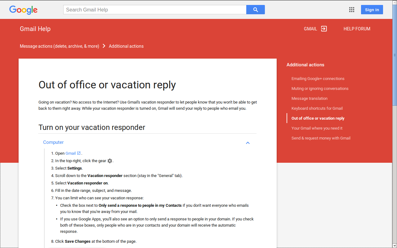
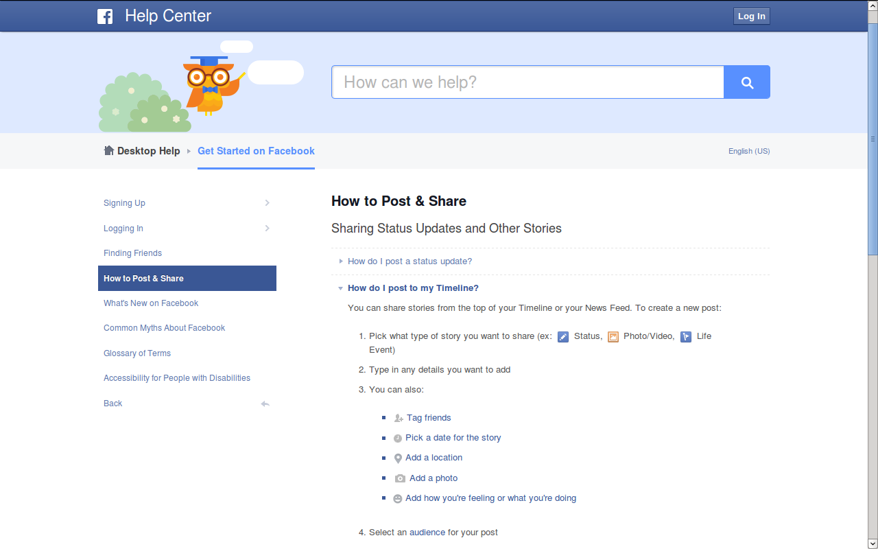
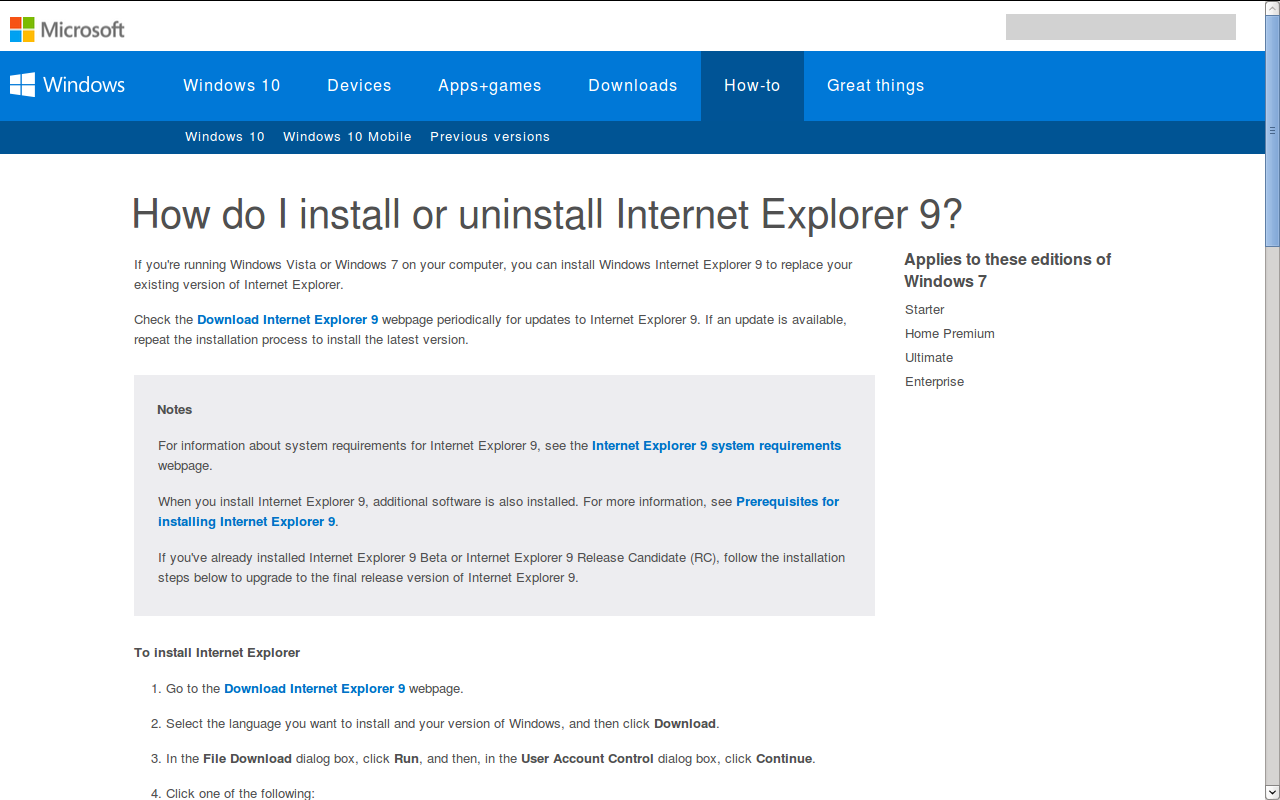
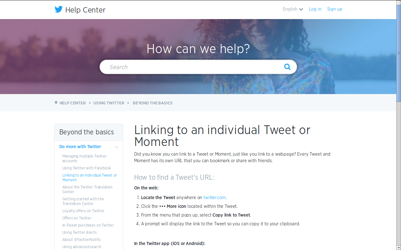
- File facebook.png added
- File gmail.png added
- File microsoft.png added
- File twitter.png added
Since we had some disagreements on the general style to adopt while presenting the steps, I searched a bit what other projects do when it comes to displaying hardcore textual documentation with numberous steps on a page. So here are a few screenshots. I couldn’t get on the Apple support pages as they are blocking Tor.
To summarize, they all tend to present the instructions themselves in a quite compact way, as if people were reading a book, with little or no graphical elements around it. The information is well structured through blocks, lists, and titles while taking as little vertical space as possible. Margins and banners around the content are big and lines are relatively short. Bold is only used to distinguish GUI labels, color only used to distinguish links.
I think this is pretty much the style I’ve adopted so far in our documentation, though I’m not an expert and things can surely be improved. But please take all this into consideration before diverging from what seems to be a strong industry standard here.
#28 Updated by sajolida 2015-11-19 09:06:49
- Priority changed from Elevated to Normal
#29 Updated by tchou 2015-11-23 08:49:46
- Status changed from In Progress to Resolved