Feature #7082
Restructure the homepage
33%
Description
Following the discussion of this thread https://mailman.boum.org/pipermail/tails-dev/2014-April/005476.html we agree somehow that we want to rethink the website, starting with the homepage.
Files
Subtasks
| Feature #6161: Add a "What is Tails?" title on homepage | Duplicate | 0 |
|||
| Feature #7681: Draw a wireframe of the homepage | Confirmed | 0 |
|||
| Feature #12257: Add a screenshot to our homepage | Confirmed | 0 |
History
#1 Updated by Anonymous 2014-04-14 10:46:07
- File <del>missing: tails mockup home2.png</del> added
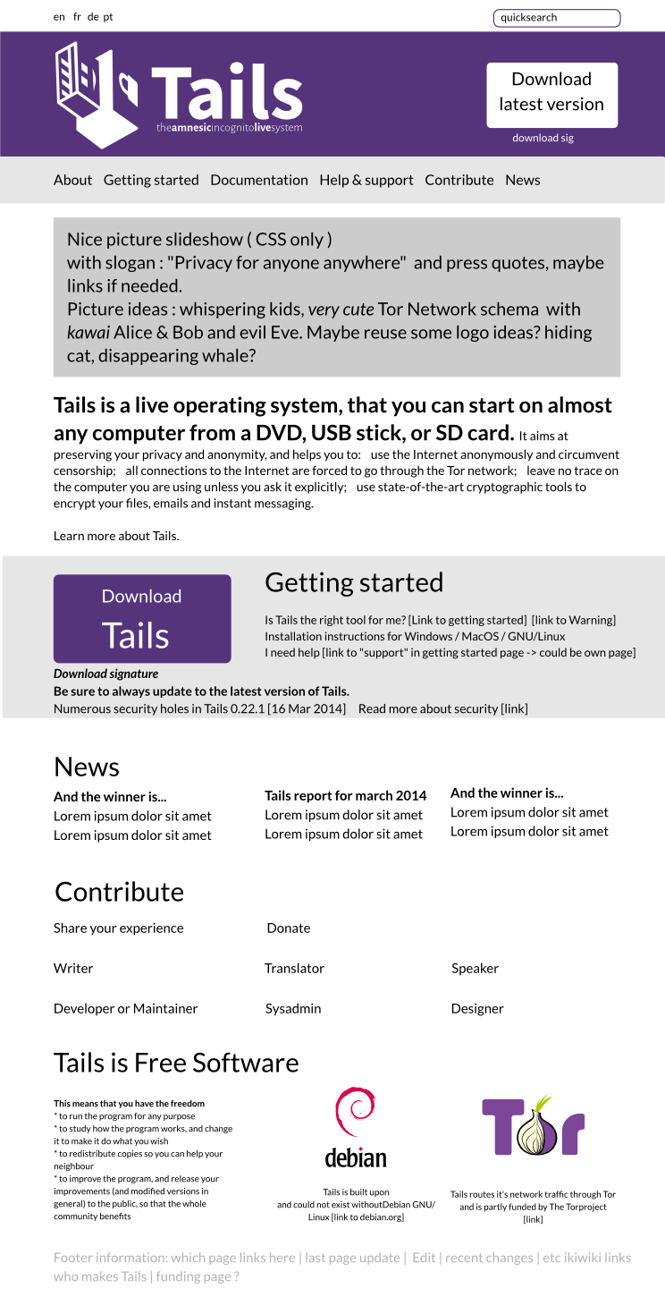
I made a quick mockup of how the homepage could look like. Open for comments. If anybody wants to have the original file, i can send that to you and you can modify it.
#2 Updated by intrigeri 2014-04-14 12:14:14
- Status changed from New to Confirmed
At first look, I do like it. I’ll try to think of it later and to comment more seriously :)
#4 Updated by Anonymous 2014-04-14 20:17:13
- File deleted (
tails mockup home2.png)
#5 Updated by Anonymous 2014-04-15 16:24:05
feedback / discussion with jvoisin:
doesn’t like horizontal menus.
jvoisin thinks the “introduction” (Tails is a live operating system blablabla) may fit as a replacement for “getting started”, i.e. squeeze the Getting started text, and replace it with the “Tails is a live operating system blablabla” one :)
dont repeat the download button.
but keep it in the header. maybe with a link beneath it to go to the download page directly.
or think about a download tab in the menu
Apart from those little suggestions, jvoisin likes it.
we should probably also add FAQ to the menu
#6 Updated by Anonymous 2014-04-15 16:25:29
other feedback:
somebody else said to me in private that he likes it a lot.
#7 Updated by t3x 2014-04-15 21:00:03
The mockup looks really nice and clean, just two minor suggestions:
-add more green (the Tails green and purple contemplate each other really well)
-less purple (way too much purple currently on the page)
#8 Updated by sajolida 2014-04-16 09:25:12
- Subject changed from Rethink homepage structure / Make website friendlier to Restructure the homepage
#9 Updated by sajolida 2014-04-16 09:25:35
- related to
Feature #6162: Simplified homepage added
#10 Updated by esperal 2014-05-09 15:35:41
My biggest pain with the website is finding stuff. User experience… it should not be frustrating for users to find what they are looking for. For example, FAQ, Contact Us, Press & Media, Current Issues should be included in the menu. I think an accordion based navigation could do the job. For example http://media02.hongkiat.com/css-based-accordion/demo/index.html and http://tympanus.net/Tutorials/CSS3Accordion/index2.html .Both are CSS-only, no javascript. They could be easily styled to match the look and feel of the current menu. Inside each expanding panel we could place more links.
#11 Updated by sajolida 2014-05-11 03:18:23
- related to Feature #7214: Have submenus added
#12 Updated by sajolida 2014-05-11 03:19:55
Answer to https://labs.riseup.net/code/issues/7082#note-10
> My biggest pain with the website is finding stuff. User experience…
> it should not be frustrating for users to find what they are looking
> for. For example, FAQ, Contact Us, Press & Media, Current Issues
> should be included in the menu.
That’s very important feedback, thanks!
- The Press is pretty badly linked, indeed. It’s only linked from the
middle of the About page.
- The FAQ and Current Issues are linked from the homepage of the Support
which is where they belong, but having direct links from the sidebar
will surely make them easier to find.
- Contact Us is inlined from the Support and Contribute section but yes,
maybe we should have a, central or different page outside of those
section. For example, if you’re the press and want to contact us.
> I think an accordion based navigation
> could do the job. For example
> http://media02.hongkiat.com/css-based-accordion/demo/index.html and
> http://tympanus.net/Tutorials/CSS3Accordion/index2.html. Both are
> CSS-only, no javascript. They could be easily styled to match the
> look and feel of the current menu. Inside each expanding panel we
> could place more links.
That looks good. We tried to limit the content of the sidebar to less
than 10 top items but adding submenus is definitely a good option to
make more content accessible from the sidebar without overloading it.
#13 Updated by sajolida 2014-05-11 03:20:44
> My biggest pain with the website is finding stuff. User experience… it should not be frustrating for users to find what they are looking for. For example, FAQ, Contact Us, Press & Media, Current Issues should be included in the menu. I think an accordion based navigation could do the job. For example http://media02.hongkiat.com/css-based-accordion/demo/index.html and http://tympanus.net/Tutorials/CSS3Accordion/index2.html .Both are CSS-only, no javascript. They could be easily styled to match the look and feel of the current menu. Inside each expanding panel we could place more links.
That goes beyond the homepage for me, so I created a new ticket on restructuring the sidebar.
#14 Updated by Anonymous 2014-05-14 14:09:05
Thanks a lot for this useful feedback. I agree fully that there are some things which are really hard to find. (press page indeed)
I used the search a lot and i found that the search results are quite horrible visually and thus for comprehension of what i am actually looking at there :)
I recently read this article which might also give some ideas: https://openitp.org/design-review/gathering-user-feedback-what-our-community-is-and-isn-t-doing.html
* What do users see first on that page?
* What options are made available to users on that page?
* What questions does the page ask users about the problems they are having?
read on over there..
#15 Updated by sajolida 2014-05-15 07:49:43
> I recently read this article which might also give some ideas: https://openitp.org/design-review/gathering-user-feedback-what-our-community-is-and-isn-t-doing.html
>
> * What do users see first on that page?
> * What options are made available to users on that page?
> * What questions does the page ask users about the problems they are having?
I understand that those questions relate to the homepage for user
support, not the general homepage. In our case that would be /support
and maybe the sidebar “Help & Support”.
#16 Updated by Anonymous 2014-05-15 09:24:10
Right, that was not exactly the correct ticket for this comment. Sorry about that.
#17 Updated by BitingBird 2014-07-01 13:02:02
- related to deleted (
Feature #6162: Simplified homepage
#18 Updated by BitingBird 2014-07-01 13:02:19
- has duplicate
Feature #6162: Simplified homepage added
#19 Updated by intrigeri 2014-07-19 15:52:35
I think this was worked on during the Tails HackFest and/or summit. Could the output be made available somewhere, e.g. as a blueprint, or finer-grained sub-tickets?
#20 Updated by Anonymous 2014-07-20 16:11:11
I think the outcome of the discussion at the hackfest/summit should be documented by tchou or sajolida.
#21 Updated by intrigeri 2014-07-20 16:46:02
- Assignee set to tchou
- QA Check set to Info Needed
#22 Updated by intrigeri 2014-07-20 16:47:49
- related to deleted (
Feature #7214: Have submenus)
#23 Updated by intrigeri 2014-07-20 16:48:39
- Parent task set to Feature #7627
#24 Updated by intrigeri 2014-07-28 17:07:13
- blocks Feature #7681: Draw a wireframe of the homepage added
#25 Updated by tchou 2014-07-28 17:10:34
Some notes taken from the summit (should go on a blueprint) :
* Menu to different sections
Discover
User
Contributor
* What is Tails
Show the differents steps of a usual Tails UX Feature #7492
* Key features
* Small all-in-one device
* Preconfigured for privacy and security
* Out-of-the-box
* Free software: trustable (and gratis)
* Secure system in unsecure environment
* Run on most laptop and desktop computers
* Leave no trace
* Emergency shutdown
* Adaptable to your needs
* All-in-one security toolbox
* Offline mode
* Screencast, tour
Key tools
* Encrypted storage and configuration (only when you want it) : persistence
* Secure instant messaging : Pidgin + OTR
* Encrypted emails : Claws + GPG
* Anonymous browsing : Torbrowser
* Censorship circumvention
* Windows camouflage
* Office and multimedia work
* Password management (?)
- Testimonials
- Journalists
- Activists
- Privacy concerned people
- Use cases
- work
- travelling
- protect sources
- anonymously
- Keep in touch
#26 Updated by sajolida 2014-07-31 17:04:00
- blocked by deleted (
Feature #7681: Draw a wireframe of the homepage)
#27 Updated by sajolida 2014-07-31 17:04:56
- Blueprint set to https://tails.boum.org/blueprint/website_homepage/
#28 Updated by sajolida 2014-12-11 19:27:33
- Target version set to 239
#29 Updated by sajolida 2014-12-11 19:41:49
- Target version deleted (
239)
#30 Updated by BitingBird 2015-04-10 20:52:05
- Assignee deleted (
tchou) - QA Check deleted (
Info Needed)
info provided