Feature #10644
Have CSS for printing
0%
Description
Files
Subtasks
History
#1 Updated by sajolida 2015-11-24 02:42:51
- Parent task set to
Feature #8590
#2 Updated by tchou 2015-12-12 07:14:19
- Target version changed from Tails_1.8 to Tails_2.0
#3 Updated by sajolida 2016-01-05 17:46:27
- Parent task changed from
Feature #8590toFeature #8592
#4 Updated by sajolida 2016-01-05 18:39:52
- File ubuntu.pdf added
The current output from Tails looks like this. There are some serious display issues on the first page but the instructions are otherwise readable. We could improve a bit the horizontal alignement to fill up the page better.
#5 Updated by sajolida 2016-01-05 21:39:33
Actually, the troubleshooting sections are hidden in the PDF so that’s a serious blocker. Raising priority accordingly. This is related to Feature #10641.
#6 Updated by sajolida 2016-01-17 19:24:19
- Priority changed from Normal to Elevated
#7 Updated by tchou 2016-01-18 16:25:36
- File ubuntu-print-steps.pdf added
- Assignee changed from tchou to sajolida
- QA Check set to Ready for QA
- Feature Branch set to web/10644-CSS-for-printing
Here is a first version. I used trick from http://www.alsacreations.com/astuce/lire/1160-une-feuille-de-styles-de-base-pour-le-media-print.html (finaly not the trickiest ones) and from our responsive version (1 column).
If we want to introduce the print version, there is a “.print” class that is displayed on print (For example for a warning about the doc version).
#8 Updated by sajolida 2016-01-20 14:42:03
- File truncated.png added
- File missing caption.png added
- File sans.png added
- File vendors.png added
- File sans.pdf added
- File serif.pdf added
- Assignee changed from sajolida to tchou
- QA Check changed from Ready for QA to Dev Needed
- I see truncated step numbers. See attachment.
- I think
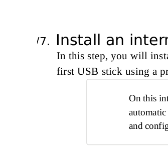
.toggle { display: none; }hides the caption of link opening toggles. See attachment. - We use toggles for content that’s not meant to be followed always and by everybody (for example, troubleshooting or alternative path in the case of
dd). So I think this should be translated into CSS. At the moment, it’s hard to know, for example in /install/linux/usb, that theddinstructions are an alternative to GNOME Disks or that the troubleshooting instructions are not meant to be followed if Tails starts correctly. I suggest improving their affordance to make them look more like special blocks. What about:- Adding “Alternative method” like we have “Troubleshooting” for the
ddinstructions? - Add a light gray background or a border or some bigger margins, etc.?
- Adding “Alternative method” like we have “Troubleshooting” for the
- Avoid writing code in anything else then English, cf. “affichage des éléments de classe print”.
- I don’t think screenshots should not be scaled up to 100%, for example “Boot Tails” and “Boot Menu” look too big right now.
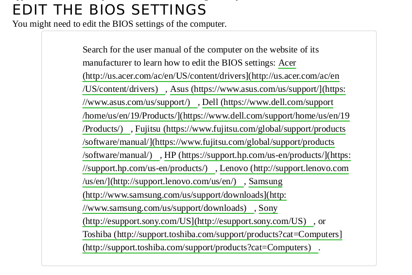
- Maybe I should format the computer vendors as a bullet list to avoid big blobs.
- You defined a “print” class that is not unused. I suggest adding only if one day we need it for something.
- I’m not convinced by the style resetting operated in the beginning
media print, here some examples:
** Some margins before notes, screenshots, and titles are broken.
** The serif font looks more dirty than our usual sans font.
** The adjustment we do to the size of monospace the font when embedded in sans is broken and looks dirty.
** Still, I printed it on paper and with the default font size it's a little bit tiny. Maybe we can do something better with
em@ (untested).
#9 Updated by tchou 2016-01-20 15:30:00
- Assignee changed from tchou to sajolida
- QA Check changed from Dev Needed to Info Needed
Just quickly on one point:
> You defined a “print” class that is not unused. I suggest adding only if one day we need it for something.
I suggest just above “(For example for a warning about the doc version)”. You don’t think we have to add something about the date of the doc, some recommandation about printing the latest version… ?
#10 Updated by sajolida 2016-01-20 18:15:48
- Assignee changed from sajolida to tchou
- QA Check changed from Info Needed to Dev Needed
Sorry, I read you review request, then jumped to the code, and forgot about your comment on the print class. What you’re saying makes sense even if we have no plans for such content. So mine makes sense as well. But honestly, I don’t care :)
#11 Updated by tchou 2016-01-24 15:21:22
- Assignee changed from tchou to sajolida
- QA Check changed from Dev Needed to Ready for QA
sajolida wrote:
> * I see truncated step numbers. See attachment.
ok.
> * I think .toggle { display: none; } hides the caption of link opening toggles. See attachment.
ok.
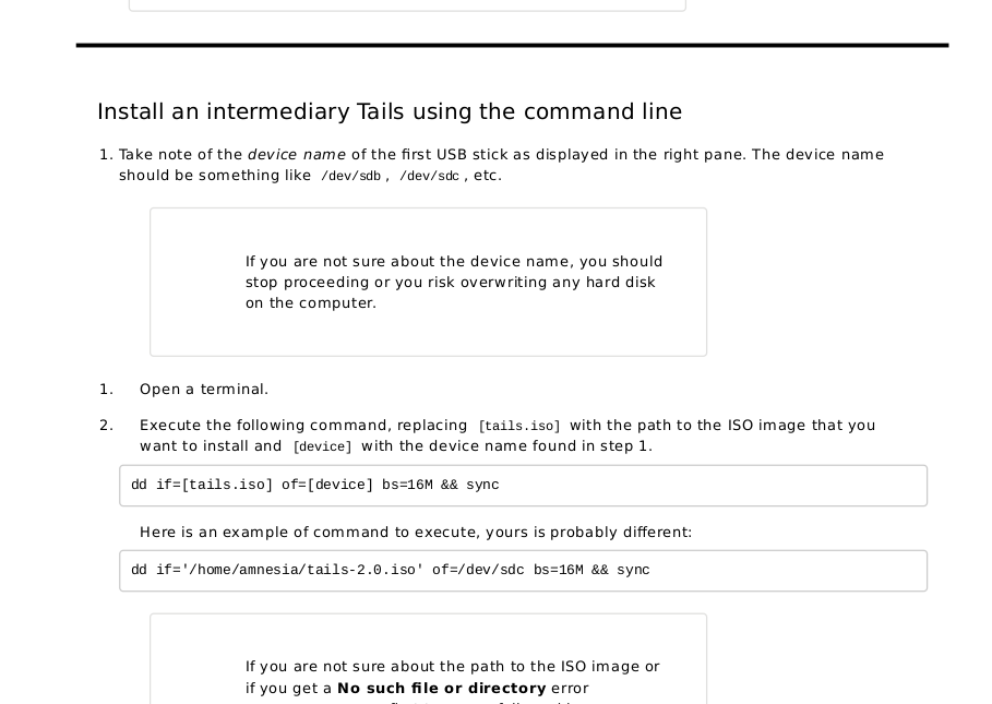
> * We use toggles for content that’s not meant to be followed always and by everybody (for example, troubleshooting or alternative path in the case of dd). So I think this should be translated into CSS. At the moment, it’s hard to know, for example in /install/linux/usb, that the dd instructions are an alternative to GNOME Disks or that the troubleshooting instructions are not meant to be followed if Tails starts correctly. I suggest improving their affordance to make them look more like special blocks. What about:
> Adding “Alternative method” like we have “Troubleshooting” for the dd instructions?
> Add a light gray background or a border or some bigger margins, etc.?
- I don’t understanf the point avout the “Alternative method”
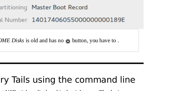
- It’s not possible to use background with print media.
- I changed the font-family, font-size and border style
> * Avoid writing code in anything else then English, cf. “affichage des éléments de classe print”.
ok.
> * I don’t think screenshots should not be scaled up to 100%, for example “Boot Tails” and “Boot Menu” look too big right now.
ok.
+ I added some styles not to split images between 2 pages.
> * Maybe I should format the computer vendors as a bullet list to avoid big blobs.
Yes. I could find some css tricks too (but not time to experiment now).
> * You defined a “print” class that is not unused. I suggest adding only if one day we need it for something.
> * I’m not convinced by the style resetting operated in the beginning @media print, here some examples:
> Some margins before notes, screenshots, and titles are broken.
> The serif font looks more dirty than our usual sans font.
- I removed the margin and the font onces.
> The adjustment we do to the size of monospace the font when embedded in sans is broken and looks dirty.
I don’t get why it changed (no time to test). Maybe we need to has some pt font size.
> Still, I printed it on paper and with the default font size it’s a little bit tiny. Maybe we can do something better with em (untested).
- em is not supposed to be used for print, but to change the pt.
It’s not yet perfect but you can do a new review.
#12 Updated by sajolida 2016-01-24 16:25:18
- Assignee changed from sajolida to tchou
- QA Check changed from Ready for QA to Info Needed
I still see 1e533dd on top of tchou/web/10644-CSS-for-printing. Are you sure you pushed that?
#13 Updated by tchou 2016-01-24 23:09:25
- Assignee changed from tchou to sajolida
- QA Check changed from Info Needed to Pass
git *pull* tchou web/10644-CSS-for-printing
:)
must be ok now.
#14 Updated by sajolida 2016-01-25 15:03:04
- QA Check changed from Pass to Ready for QA
#15 Updated by sajolida 2016-01-25 23:35:20
- Status changed from Confirmed to Resolved
- % Done changed from 0 to 100
Applied in changeset commit:0c934ea5b1b17c3405649f2e07913ccfff80973d.
#16 Updated by sajolida 2016-01-25 23:59:07
- Status changed from Resolved to Confirmed
- Assignee deleted (
sajolida) - % Done changed from 100 to 0
- QA Check deleted (
Ready for QA)
All of this looks very good, merged!
#17 Updated by sajolida 2016-01-25 23:59:21
- Status changed from Confirmed to Resolved